Marketers spend good money to drive qualified traffic to your landing page. Let’s face it: there’s a ton of competition online and it’s not easy to cut through the digital noise. And once you do manage to get the right people on your page, you want to make sure your page is strong enough to convert them into leads (or better yet — paying customers).
Studies show you only have about 8 seconds to make a first impression, and in those 8 seconds, your visitor is deciding whether to keep reading or bounce.
So, how can you ensure your landing page will convert your hard-earned traffic? While there is no magic formula or guarantee, high-converting landing pages tend to have these 6 characteristics in common:
1. One Core Goal
You may have a lot to offer your audience, but your landing page is the place where you get specific on just one objective. This is Step One when creating a landing page from scratch — defining the purpose of the page and deciding what you ultimately want to achieve.

For example, if you’re promoting your upcoming webinar, everything about your landing page should be designed to encourage registration. It’s not a place to collect email addresses for newsletters or direct them to your blog. Every element on that page should somehow support your core goal.
HubSpot does an excellent example of this with their webinar content. When you look at the page, there’s no question of what the offer is about and what action to take.
2. A Powerful Headline
If you had to spend a dollar writing the copy for your landing page, 80 cents should go directly into your headline — it’s that important! Your headline is the first thing people will read when they land on your page. In fact, data suggests that 8 out of 10 people read the headline and don’t go any further.
Your headline should be compelling enough to make the reader want to learn more, yet short and concise enough to get the point across. The last thing you want to do is leave your reader guessing about what you’re offering.
DoorDash created a strong headline for their Become a Dasher landing page: “Your Time. Your Goals. You’re the Boss. Drive, deliver, and earn with DoorDash.”
It’s short yet clear, plus it instantly puts the user into the shoes of what it’s like to be a Dasher.
3. Compelling Copy
Landing pages include a variety of copy on the page to explain the service or offering and encourage conversions. Your copy shouldn’t focus on the mechanics of the offer, but rather the benefits of why the user should sign up or purchase. Give your user a reason (or reasons) to input their information or pull out a credit card. Help them see exactly what they stand to gain.

Here’s a powerful example from EduPath. Once you scroll past the headline, you’ll get more of an explanation about how EduPath helps teens prepare for the SAT & ACT. The text is relatable for teens and parents alike and highlights the benefits of the service instead of getting too technical about how the service is delivered.
4. Images or Videos
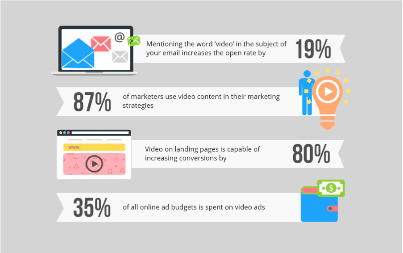
Visuals are powerful elements on landing pages because they help to support and improve the rest of the content. In fact, research shows that the brain processes visual information up to 60,000 times faster than text! This means that when your visitor lands on a page, they can start putting your message together before they even read the first word.
Some things you’ll want to keep in mind as you’re choosing visual content for your landing page:
- Images and videos should be contextually relevant to your offer and goal – stock photos are usually not the route to take here
- They should be high quality – grainy images or glitchy videos may de-value the appearance of your offering
- They must load quickly – page load speed affects SEO, and taking too long to load will increase your bounce rate
If you’re selling a product, then using an image or video of that product is a no-brainer. If you’re selling a service, however, you need a little more creativity. Consider using a video of yourself talking about the user’s pain points and highlighting how you can help. Or, you might include a video of customer success stories that can add to your credibility.

5. Pain and Pleasure Points
It’s Psychology 101: As humans, we’re wired to avoid pain as much as possible. And when we are taken out of our comfort zone and confronted with pain, we want to take action as soon as possible to resolve it.
Your product or service is designed to relieve pain in some form. Maybe it’s to solve a business challenge, save money, or improve the way something is done. Regardless, your copy should bring those pain points front and center so that your readers become aware of them and want to find a way to cure them.
Search Engine Land does a good job of emphasizing real pain with this webinar promotion on how Google steals website traffic. It dials in on the fact that you could be getting short-changed on website visitors, something that any digital marketer would be stark-raving mad about.
In addition, humans are also wired to respond to potential gains of pleasure. We don’t buy into products or services because we like them, but rather because of the joy and relief they’ll bring us. Your copy should also contain elements of pleasure that will help the user see themselves in the end result.

6. A Clear Call to Action
Last but not least, there should be no question about what your audience should do to take advantage of your offer. Make it easy for them to make the leap and convert, and limit your CTA to just one. The quicker and more explosive you can make your CTA, the more likely your user will be to take advantage of what you’re offering.
For more insights, check out my blog post on how to ramp up your landing pages for conversions.


